
Is My Trading Strategy Actually Worth Trading?
You ran a backtest. The equity curve goes up. The profit factor is above 1. You're ready to trade it live, right?
Not so fast.
A positive backtest is the beginning of the evaluation process, not the end. The uncomfortable truth is that most strategies with good-looking backtest results are not actually tradeable. They're the product of curve fitting, optimization bias, or market conditions that won't repeat. And the worst part? The standard metrics most traders look at — net profit, win rate, profit factor — can't tell you the difference.
In Part 1 of this series, we covered how to generate backtest results using NinjaTrader's various testing methods. This article tackles the harder question: how do you know if those results actually mean anything?
We'll walk through every metric and analysis method that separates a tradeable strategy from a curve-fit illusion. Along the way, we'll compare two real strategies — one that passes every test, and one that fails spectacularly — so you can see exactly what to look for.
Why the Standard Metrics Aren't Enough
Let's start with what most traders look at when evaluating a strategy:
- Net profit — Did it make money?
- Win rate — How often does it win?
- Profit factor — Gross profit divided by gross loss.
- Max drawdown — How bad did it get?
These are fine as a first-pass filter. If a strategy is net negative, you can stop right there. But a strategy that shows $30,000 in profit with a 67% win rate and a 1.25 profit factor could be either of these:
- A robust edge that will continue performing in live trading, or
- A curve-fit artifact that happened to look good on historical data but has zero predictive value going forward.
The standard metrics can't tell you which one you're looking at. You need deeper analysis. Here's what that looks like.
Equity Curve Quality (R²)
The equity curve is the single most revealing chart in strategy evaluation — but not in the way most people think. Traders tend to look at the final value (did it go up?) when they should be looking at the shape (how did it get there?).
R² (R-squared) measures how closely the equity curve follows a straight line. It ranges from 0.000 (completely erratic) to 1.000 (perfectly linear). A high R² means the strategy made money consistently over time, not in lucky bursts followed by painful drawdowns.
Here's what the difference looks like in practice:
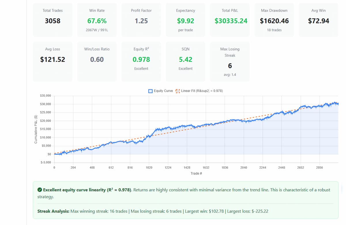
Strategy A — R² = 0.978 (Excellent)
This equity curve hugs the linear regression line tightly. Profits accumulated steadily across 3,058 trades over six years. There are drawdowns — every strategy has them — but the overall trajectory is consistent. The curve looks essentially the same whether you're looking at the first 1,000 trades or the last 1,000. That's what R² = 0.978 looks like.
Strategy B — R² = 0.000 (Poor)
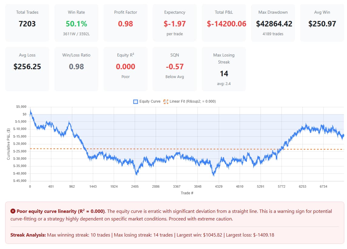
This equity curve is a mess. It drops $40,000 in the first half, partially recovers in the second half, and ends up net negative. The linear regression line (the dashed orange line) is essentially flat because there's no consistent direction. R² = 0.000 means the straight line explains none of the equity curve's movement. It's random noise.
And here's the thing — if you only looked at the last 1,500 trades of Strategy B, it would look profitable. That's the trap. Zooming in on a favorable window can make any random walk look like an edge.
What to Look For
| R² Range | Rating | Interpretation |
|---|---|---|
| 0.95 – 1.00 | Excellent | Highly consistent returns. Strong candidate for live trading. |
| 0.85 – 0.95 | Good | Consistent with some variance. Worth further analysis. |
| 0.70 – 0.85 | Average | Noticeable drawdown periods. Proceed with caution. |
| Below 0.70 | Poor | Erratic returns. High probability of curve fitting or regime dependence. |
System Quality Number (SQN)
The System Quality Number, developed by Dr. Van Tharp, measures the overall quality of a trading system by looking at the relationship between average trade expectancy and the variability of trade results. In plain English: how much does the strategy make per trade relative to how volatile those results are?
A strategy that makes $10 per trade with very consistent results (low variance) scores higher than one that makes $20 per trade but swings wildly between big winners and big losers. SQN rewards consistency.
How It's Calculated
SQN = (Average trade P&L / Standard deviation of trade P&L) × √(Number of trades)
The square root of trade count matters — it means SQN increases with sample size, which is appropriate because more trades give you more confidence in the result.
What the Numbers Mean
| SQN Range | Rating | Interpretation |
|---|---|---|
| 5.0+ | Excellent | Very high quality system. Rare and highly tradeable. |
| 3.0 – 5.0 | Good | Solid system with a clear edge. |
| 2.0 – 3.0 | Average | Modest edge. Tradeable but expect volatility in results. |
| 1.0 – 2.0 | Below Average | Weak edge. May not survive transaction costs and slippage. |
| Below 1.0 | Poor | No meaningful edge detected. Do not trade. |
Strategy A scores an SQN of 5.42 (Excellent). The combination of positive expectancy ($9.92 per trade on MNQ), consistent results, and a large sample size (3,058 trades) produces a high-quality score.
Strategy B scores an SQN of -0.57 (Below Average). Negative SQN means the strategy is losing money on average, and the results are volatile. This is not a tradeable system.
Stability Analysis — The Curve-Fit Killer
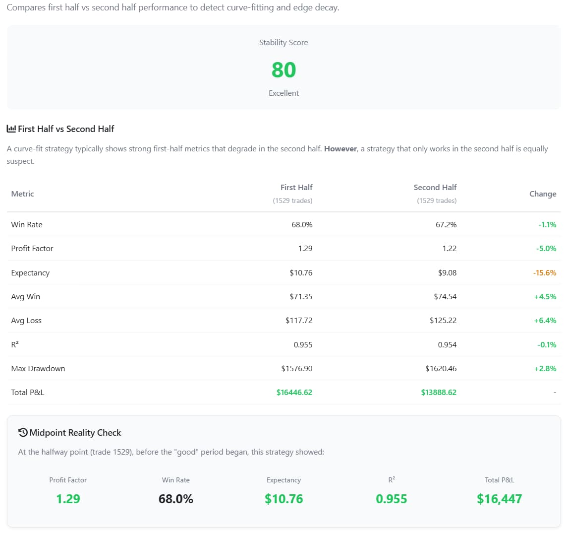
This is one of the most powerful tests you can run, and most traders have never heard of it. The concept is simple: split your backtest in half and compare the two halves.
A robust strategy should perform reasonably well in both halves. The profit factor doesn't need to be identical, but both halves should be profitable with similar characteristics. If the strategy only works in the second half, that's a classic signature of curve fitting — the parameters were optimized on recent data, and the "backtest" is really just showing you the optimization period.
The Midpoint Reality Check
Here's the question that makes this test so powerful: "If you'd gone live at the halfway point of the backtest, would you have stayed live?"
Look at the equity curve at the midpoint. If the strategy was deep underwater at that point, no rational trader would have continued running it. Which means the only reason it looks good in the full backtest is because the second half happened to recover — or more likely, the parameters were tuned to make the second half work.
What It Looks Like
Strategy A:
- First half profit factor: 1.32
- Second half profit factor: 1.27
- Midpoint equity: +$17,993 (profitable, you'd have stayed live)
- Stability Score: 80 (Excellent)
Both halves are profitable with similar profit factors. The slight decline from 1.32 to 1.27 is normal and actually more realistic than a strategy that gets better over time (which often indicates optimization on recent data).
Strategy B:
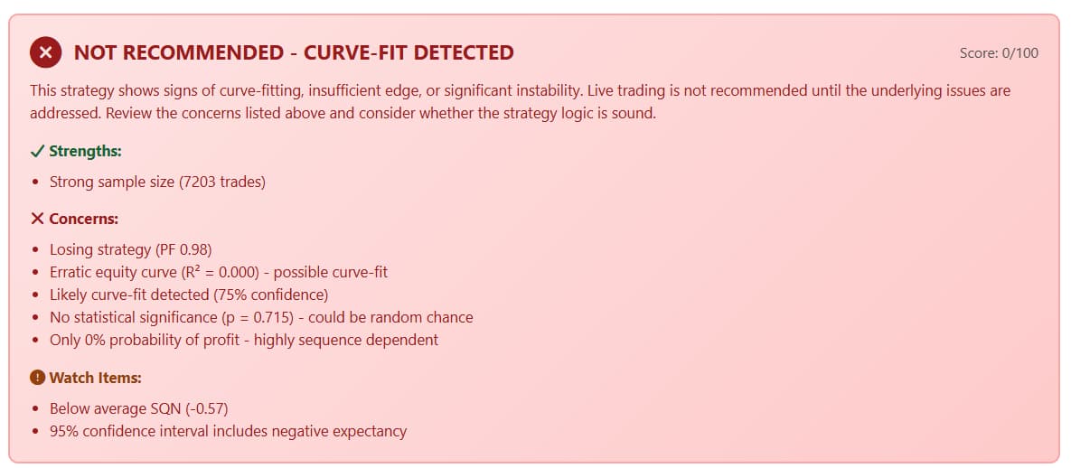
- First half profit factor: 0.93
- Second half profit factor: 1.80
- Midpoint equity: -$29,301 (deep underwater, you'd have pulled the plug)
- Stability Score: 51 (Poor)
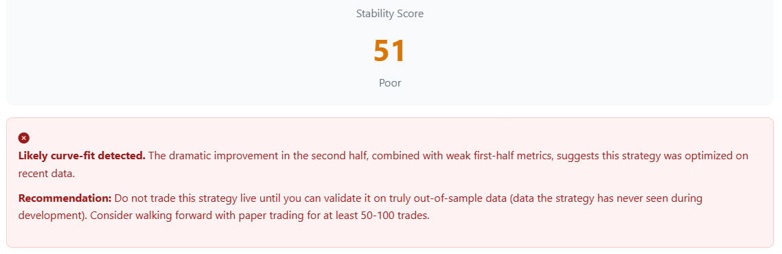
This is the textbook curve-fit signature. The first half is a losing strategy (PF 0.93). The second half suddenly becomes highly profitable (PF 1.80). The dramatic improvement in the second half, combined with weak first-half metrics, suggests this strategy was optimized on recent data.
At the midpoint, you'd be sitting on a $29,301 loss. No trader in their right mind would continue. The only way this strategy looks good is in hindsight, with the full dataset available during optimization.
What Good Stability Looks Like
| Stability Score | Rating | Interpretation |
|---|---|---|
| 75 – 100 | Excellent | Consistent performance across both halves. High confidence. |
| 55 – 75 | Average | Some variance between halves. Investigate further. |
| Below 55 | Poor | Significant instability. Possible curve fitting. |
Monte Carlo Simulation — 5,000 Alternate Universes
Your backtest shows one specific sequence of trades. But what if the trades had occurred in a different order? What if that big winner came later? What if the losing streak happened at the beginning instead of the middle?
Monte Carlo simulation answers these questions by randomizing the order of trades across thousands of simulations (typically 5,000) and plotting the resulting equity curves. This gives you a distribution of possible outcomes rather than a single path.
What It Tells You
- Probability of profit — What percentage of the 5,000 simulations ended profitable? You want 95%+ for a tradeable strategy.
- Drawdown distribution — What's the worst drawdown you might realistically experience? The 95th percentile drawdown from Monte Carlo is a better risk estimate than the single max drawdown from your backtest.
- Equity curve confidence band — The range of possible equity paths shows you how much variation to expect. A tight band means consistent results regardless of trade sequence. A wide band means the strategy is sequence-dependent.
The Two Extremes
Strategy A: 100% probability of profit across 5,000 simulations. Every single randomization of the trade sequence ended profitable. This means the edge isn't dependent on a lucky ordering of trades — it's robust enough to survive any sequence.
Strategy B: 0% probability of profit across 5,000 simulations. Every single randomization ended at the same loss. When a strategy is net negative, shuffling the trade order doesn't help — you're just rearranging losses.
Most strategies will fall somewhere between these extremes. A Monte Carlo probability of profit below 80% is a serious warning sign. Below 60% and you're essentially gambling on getting a favorable trade sequence.
Edge Detection — Is the Edge Statistically Real?
This is where we move from descriptive statistics (what happened) to inferential statistics (can we conclude this edge is real). The question is simple: could a random strategy have produced these results by chance?
Edge detection uses hypothesis testing to answer this. The null hypothesis is that the strategy has no edge (expected return = 0). We then calculate the probability of observing results as good as the backtest under that null hypothesis. That probability is the p-value.
P-Values in Plain English
| P-Value | Interpretation |
|---|---|
| p < 0.001 | Highly significant. Less than 0.1% chance this is random. Strong evidence of a real edge. |
| p < 0.01 | Very significant. Less than 1% chance this is random. |
| p < 0.05 | Significant. Less than 5% chance this is random. Standard scientific threshold. |
| p > 0.05 | Not significant. Can't rule out random chance. Insufficient evidence of an edge. |
Confidence Intervals Matter Too
A p-value tells you whether an edge exists. Confidence intervals tell you how big it might be. A 95% confidence interval for expectancy gives you the range within which the true per-trade expectancy likely falls.
Strategy A: p < 0.001 (Highly Significant). The 95% confidence interval for expectancy is $6.90 to $14.10 per trade. The entire interval is positive — even the worst-case estimate says the strategy has a real edge. Both win rate and expectancy tests confirm the edge independently.
Strategy B: p = 0.715 (Not Significant). The 95% confidence interval for expectancy spans -$9.09 to +$4.75 — it crosses zero. We can't even say with statistical confidence that this strategy breaks even, let alone makes money. The results are indistinguishable from random chance.
Think about what that means. A strategy being marketed to traders shows no statistically significant edge. A coin flip with a commission would produce similar results.
Risk of Ruin
Even a strategy with a real edge can blow up if the drawdowns are too deep relative to your account size. Risk of ruin analysis calculates the probability that a strategy will hit a catastrophic loss level before reaching its profit target.
The key factors are:
- Win rate and payoff ratio — How often you win and how much you win vs. lose
- Position sizing — How much of your account is at risk per trade
- Drawdown tolerance — How much can you lose before you're forced to stop (either by your own rules or by account liquidation)
For prop firm traders especially, risk of ruin is critical. Your drawdown limit isn't theoretical — it's a hard line that ends your account. A strategy with a real edge but excessive drawdown risk can still blow through a prop firm's trailing max drawdown before the edge has time to play out.
Strategy A shows a 2.7% risk of ruin with 86.4% probability of reaching the success target. The strategy is 32.5x more likely to hit its profit goal than to hit ruin. Those are the kind of odds you want.
Noise Testing — How Fragile Is the Edge?
In live trading, you don't get the exact fill prices your backtest assumes. Slippage happens. Your market order fills a tick or two worse than expected. The question is: does the strategy survive when fills aren't perfect?
Noise testing adds random adverse slippage to every trade (typically ±2 ticks) and reruns the analysis thousands of times. If the strategy collapses under a couple ticks of slippage, it's too fragile for real-world trading. The edge is an artifact of exact fills that you'll never get in production.
What Robustness Looks Like
Strategy A: Robust to ±2 tick price noise. Mean P&L across noise simulations: $30,560 (essentially unchanged from the base case). Even with worst-case adverse slippage on every single fill, mean P&L = $27,192 with 100% probability of profit. The edge is wide enough to absorb real-world execution imperfections.
Strategy B: "Highly sensitive to exact fills." Adverse slippage drops mean P&L to -$25,175. The strategy was already losing money, and imperfect fills make it significantly worse. This tells you that even the modest periods of profitability in the backtest depended on getting unrealistically precise fills.
E-Ratio — Does the Strategy Actually Capture Movement?
The E-Ratio (Edge Ratio), originally developed by Build Alpha, measures whether your strategy’s entries are actually capturing directional price movement better than random entries would.
An E-Ratio above 1.0 means your entries are identifying moments where price is more likely to move in your predicted direction than against it. An E-Ratio at or below 1.0 means your entries are no better than random.
How to Read It
The E-Ratio is measured at each bar after entry. A strategy might show:
- Bar 1: E-Ratio 1.05 (slight edge immediately after entry)
- Bar 5: E-Ratio 1.10 (edge building as the move develops)
- Bar 11: E-Ratio 1.12 (peak edge)
- Bar 20: E-Ratio 1.08 (edge starting to decay)
This tells you the optimal holding period and confirms that the entry signal is actually capturing a real price phenomenon, not just noise.
Strategy A peaks at an E-Ratio of 1.12 at bar 11 (approximately 55 minutes after entry on 5-minute bars) and sustains edge for 30+ bars. It outperforms random entries by +0.10 on average. The entries are genuinely identifying moments of directional price movement.
Red Flags Checklist
Beyond the formal metrics, there are several warning signs that should make you skeptical of any strategy's backtest results — including your own:
Profit Concentration
If the majority of a strategy's profits come from a single day of the week, a narrow time window, or a short historical period, that's a problem. A robust edge should be distributed across time. For example, if 76% of profits come from Thursdays alone, the strategy may be exploiting a specific data artifact rather than a genuine market inefficiency.
Recent-Only Profitability
If only the most recent year or two is profitable and the earlier years are flat or negative, the strategy was likely optimized on recent data. This is the stability analysis problem we discussed earlier — the "midpoint reality check" catches this pattern.
Only One Year Profitable Out of Many
If you have four years of data and only one year is profitable, you don't have a strategy. You have one good year and three bad ones. Even if the net result is positive, the lack of consistency across years is a dealbreaker.
Optimization Sensitivity
If changing a parameter by 1 unit (say, from 6 to 7) causes the strategy to go from profitable to unprofitable, the parameter is overfit to the specific dataset. Robust strategies work across a range of parameter values, not just one magic number.
Unrealistic Win/Loss Ratio
A 50.1% win rate with nearly identical average wins and average losses (for example, $251 avg win vs. $256 avg loss) produces a losing strategy after commissions and slippage. There's no edge — it's a coin flip with a slight disadvantage.
Excessive Trade Count Without Edge
A high number of trades (5,000+) might seem like a strength — more data, right? But if those trades show no statistical edge (p > 0.05), all that volume means is that the strategy traded a lot without making money. Volume without edge is just churning commissions.
Putting It All Together — A Complete Comparison
Let's put everything side by side. These are two real strategies run through the same analysis framework:
| Metric | Strategy A | Strategy B |
|---|---|---|
| Robustness Score | 100 / 100 | 0 / 100 |
| Total Trades | 3,058 | 7,203 |
| Win Rate | 67.6% | 50.1% |
| Profit Factor | 1.25 | 0.98 |
| Total P&L | +$30,335 | -$14,200 |
| Expectancy | +$9.92 / trade | -$1.97 / trade |
| Equity R² | 0.978 (Excellent) | 0.000 (Poor) |
| SQN | 5.42 (Excellent) | -0.57 (Below Avg) |
| Stability Score | 80 (Excellent) | 51 (Poor) |
| 1st Half PF / 2nd Half PF | 1.32 / 1.27 | 0.93 / 1.80 |
| Monte Carlo Prob. of Profit | 100% | 0% |
| Edge Detection (p-value) | p < 0.001 (Significant) | p = 0.715 (Not Significant) |
| Noise Test (adverse slippage) | Robust — $27,192 mean P&L | Fragile — -$25,175 mean P&L |
| Risk of Ruin | 2.7% | N/A (already losing) |
| Curve-Fit Detection | No signals | Detected (75% confidence) |
| Verdict | TRADEABLE | NOT RECOMMENDED |
Strategy B has twice as many trades as Strategy A. More data should mean more confidence in the results, not less. But volume without edge is meaningless. Strategy B traded 7,203 times and still couldn't produce a statistically significant positive expectancy. Meanwhile, Strategy A's 3,058 trades are enough to confirm its edge at the p < 0.001 level.
What This Means for Prop Firm Traders
If you're trading a prop firm evaluation or funded account, these metrics aren't academic — they're the difference between passing and blowing your account.
Prop firms give you a fixed drawdown limit. You don't get infinite time to let a strategy's edge play out. You need:
- Low risk of ruin — The probability of hitting the drawdown limit before reaching the profit target needs to be small.
- Consistent daily returns — A high R² means profits accumulate steadily rather than in unpredictable bursts.
- Noise tolerance — Prop firm fills aren't always ideal, especially on fast-moving instruments like NQ/MNQ. Your strategy needs to survive real-world slippage.
- Statistical confidence — With limited capital at risk, you can't afford to trade a strategy that might have an edge. You need to know it has one.
Running your strategy through this kind of analysis before putting real money at risk is the highest-ROI time investment you can make. Paying for a prop firm evaluation with a strategy that scores 0/100 on robustness isn't trading — it's donating evaluation fees.
How to Run These Tests Yourself
We built the Aeromir Robustness Analyzer to make this entire analysis accessible to any NinjaTrader trader. Upload your Strategy Analyzer trade export and it runs every test covered in this article automatically:
- Equity curve R² with visual linear fit
- SQN calculation
- Stability analysis with midpoint reality check and curve-fit detection
- 5,000-run Monte Carlo simulation with probability of profit
- Statistical edge detection with p-values and confidence intervals
- Noise sensitivity testing with adverse slippage simulation
- E-Ratio analysis
- Risk of ruin probability
- Day-of-week profit distribution
- Comprehensive red flag screening
The tool produces an overall robustness score from 0 to 100, along with a plain-English verdict and specific concerns to investigate. It's the same analysis framework we use to validate our own strategies before going live.
Whether you're evaluating a strategy you built yourself, something you bought from a vendor, or a free strategy from the NinjaTrader community — running it through rigorous robustness analysis before risking real capital is the smart play.
The Bottom Line
A positive backtest is a starting point, not a finish line. Before you trade any strategy live — especially with real money in a prop firm account — you need to answer these questions:
- Is the equity curve consistent (R² > 0.85) or erratic?
- Is the system quality high enough to trade (SQN > 2.0)?
- Does the strategy work in both halves of the backtest, or only the recent half?
- Would you survive in 5,000 alternate trade sequences (Monte Carlo > 80% probability of profit)?
- Is the edge statistically significant (p < 0.05), or could it be random?
- Does the strategy survive real-world slippage (noise testing)?
- Is the risk of ruin acceptable for your account size and drawdown limits?
If a strategy can't answer "yes" to all seven, it's not ready for live trading. And if a vendor can't show you these metrics for their strategy, ask yourself why.
The data doesn't lie. Run the tests. Trust the math.
Related: Part 1 — NinjaTrader Backtesting: Strategy Analyzer vs. Market Replay
This article is for educational purposes only and does not constitute financial advice. Backtesting results, regardless of methodology, do not guarantee future performance. All trading involves risk of loss. Past performance is not indicative of future results.

Comments
No comments yet. Be the first to share your thoughts!
Leave a Comment